Friday, 22 May 2015

Before and After


Above it the before and after, as I copied the ending to one of the two paths when you go left I edited it to be different. I changed the wolf to Hansel and Gretel like I had intended the right path way to have, but I kept the overall scene the same.


I then changed the next scene so instead of the wolf appearing you have Hansel and Gretel looking at you, once you click their eyes you will be taken to the next scene, the same as the wolf route,


The final scene has changed it now goes to a weird scene of her being swallowed by Hansel. I thought I'd add in this twist because you wouldn't expect it.

Thursday, 21 May 2015

Critical Review

During the exhibition I gained a lot of valuable feedback for my interactive animation. I have take some of this into account and fixed my animation in the short time frame we have had left before the handing in deadline. I changed one of the endings to the Hansel and Gretel ending that I had planned in the first place and also changed the mouse to look like the hand of the character as suggested by one of my classmates. I think this really helped add a sense of placing you in the characters shoes by doing this.


Here is what the mouse now looks like when playing, I'm really happy with this changed and glad I got the recommendation to change it.


I got a lot of compliments on the style and colour choice as well as comments on enjoying the interactive aspect of the animation. The concept and story was engaging, fun and the music was interesting. However, there was a lot of people saying they would like more interactive parts through out the animation and the animation could be longer with various paths as I only had two paths with three endings - two being the same at the time which I have now fixed thanks to the feedback. They also said some of the animation could use improvement, such as the walking at the beginning and the part where she walks up to the house where some movements were to fast or slow. They enjoyed the twist at on of the endings, but there could be an ending giving the character more power.
Generally, I believe I did a reasonably good job considering the time frame I worked with, but it could have been far better as feedback suggested. I aim to finish the animation and publish it on my website where it can be played through by many others.

The exhibition experience has been with mixed feelings, there was a lot more pressure than I expected and as a team you could see some weak links show as time went on. I was slightly disappointed in the input of some of the group and I don't think some did as much as others, but in the end it did come together and we had a successful evening, which is all that matters. Though if I were to repeat this task I would prefer to do more of the work myself as I know it will get done on time.

There was a good amount of set up work to be done, but as there was a well done floor plan and job list written up for the day everything was done smoothly. The only issue was the location of the Gallery that we used, as there was limited parking and parking times we had to quickly unload and reload as well as constantly moving vehicles, which took time from those of us who drove. During the times we were moving set up had to be left to the remaining seven people. 

My overall experience of this final project has been a very big learning curve. I have been forced to push myself into completing something that is of exhibition quality and of a finished standard that I am happy to show. It was a big struggle for me as I lack in time management skills and not everything goes to plan, but with the encouragement of my classmates and tutors I was able to get it done in time.
I found that I am good at completing tasks where I am relied on by a group of people to do it on time. I did have some problems along the way, such as starting my animation late despite my production schedule and I had a few issues with the animation set-up itself, but after resolving these issues it was easy to work through the animation. 

Animation wise, the style came out more digital cut out than paper cut out, which was the initial style that I wanted to achieve, but I am still satisfied with the outcome despite this. I think I still managed to get a puppet look to the characters. However, I would have liked to look more 2D in a 3D space to give more depth to the animation scenes.

In conclusion, there was a lot more to be improved on, but I think it went well in the end and I am happy with the feedback that I received and aim to improve on what was mentioned.

Feedback From Exhibition

Below is all the feedback I received from the exhibition.


Tuesday, 19 May 2015

Exhibition Day


I also made a poster to hang near my work to help set the scene for my animation, I picked my two favourite scenes from the animation to place onto it. I came up with the name Little Lost No Hood, I decided on this as it was still based on little red riding hood, but she had the lack of a hood and I thought it was a fun twist to the name.


I also designed myself some postcard sized business cards for people to take.


I made two paper dolls of the girl and wolf to put on my table so people could play with them and interact with them in a way they couldn't in the animation.


This was the final look for my table set up, I went with a black and white theme for the table as well and then scattered some red paper in the shape of rose petals and roses on the table. I also had to prop a small sign saying to "click the red" in case people didn't know where to start. At first I didn't want to get to involved with whoever was playing through the animation, to give them a chance to experience it before I talked more about it. I found this way of leaving them to go through it by them selves gave better reactions than if I were to direct them and intervene straight away, as they had to engross themselves in the animation and work through it. 
You can see above my table set-up, lay out and people interactive with my animation on the 12th of May which was our private viewing for invited guests.


These are some screenshots of the final animation, I'm happy with how some of the scenes turned out and how they showed up on a larger screen, I don't think there was much loss of quality when it was shown on a larger screen.

We also made booklets with a small profile and summary of out work in them to give out to people who attended, the booklets were rushed at the end so there did end up being some mistakes, that looking back could have been easily changed before it was sent into print. (see attached for booklet)


Storyboard

I story boarded the first part of my animation for show, but I wanted the last part to be a whim and unpredictable so I didn't do this part. This way I had a lot more un-planned freedom with the endings and twists and turns that the story could take.

Also, not having text of the rest of the storyboard was a choice I made because I was also going to have the story board on display at the exhibition and if people were to go through it before they played the animation it would spoil the surprise.

There are two routed you can take left or right when you reach the forest, if you go left it is the wolf's route and if you go right it is the Hansel and Gretel route. I was planning on having the wolf route seem dim and bad then in the end it turns out good and the Hansel and Gretel route looking happy and safe, but turning bad. I thought this would be a fun twist to what we think would happen, you would assume the wolf route would be the bad and the Hansel and Gretel to be the good path, but I lead people into a false sense of security and then hit them with the real story.


Work In Progress

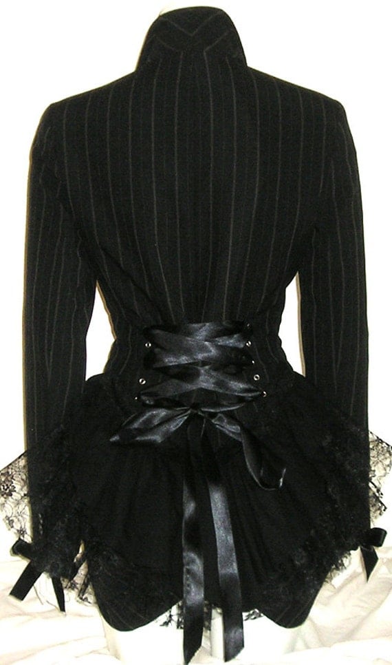
I made some character designs based on the style and theme I was going for, I wanted her to be puppet like and skeletal to add a creepy feel to her. I also wanted her clothing to be slightly older looking to suit the storyline, when I think of little red riding hood and Hansel and Gretel I think of an older style of dress, but I wanted it to be fancy at the same time so I went with a Victorian styled clothing. I did some research on Gothic Victorian clothing to help me with designing her outfit.


I made a few tests on paper to start, I made paper puppets of my designs to give me a feel of what the final animation would be like. As you can see below I ended up using these on my guest book for my exhibition. I liked the way they turned out and aimed to create something similar digitally to work with.


I put together a quick model sheet of my character to help me when animating, but when I finally went into Flash the style changed a bit on a whim, though I liked this a lot more than the design in the model sheet. 


This is a design for the character I was planing when I first started designing her. I wanted her to be skeleton like in style and also have a puppet look to her. I really liked this deign, but after importing it into Adobe Flash I was worried about the quality of the character so I decided to draw her directly into Flash. As you can see on the right this is how she looks now, I tied to keep a similar looking style to the paper based design, but ended up using less parts as this made animating with the Flash Bone Tool a lot easier.


This staircase was also drawn on paper and going to be one of the elements in my work, but again due to fear of quality I took it out.


I had some issues in Flash along the way and as you can see above this was one of many. I initially started by using the Scene system in Flash where different parts of the animation were made on different scenes and the interactive parts would be clicked and take you to the designated scene, but this turned out to have many problems. I ended up working on the timeline and making buttons that went to certain frames.